PROJECT
CosmoCATEGORY
UI/UXDESCRIPTION
Cosmo is a unique mobile mood tracker designed to visualize a user’s emotional data in the form of a constellations. Using daily entries and weekly charts as a system base, the app engages users to envision and understand their emotions over time by developing their own personalized “Cosmo Universe”.
MOOD TRACKING CONCEPT
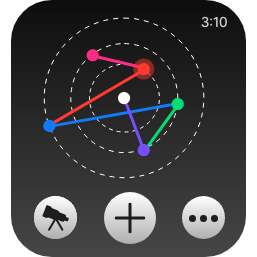
In needing to create a unique data visualization to represent daily mood tracking data, I first began by analyzing the levels that would make up that data. Within Cosmo, users will enter their daily mood with two factors in play, the emotion that is represented by a given color, and then the intensity of that emotion. Based on these factors, the entry will be placed within a specific area of the constellation graph. The circle is divided into six sectors for the six emotions, and then the three circle outlines act as the different emotion levels. Of course within a week, entries can stack if they are the same combination of input factors, but generally, every week will have a distinct constellation generated to visualize the specific entries from that time period.


APP DEVELOPMENT PROCESS
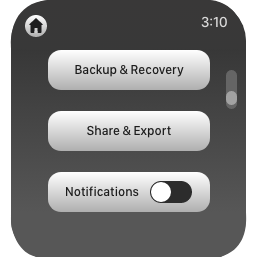
The process for developing Cosmo began with a general ideation phase, ans swiftly moved into planning the information architecture. The next step was to create a user flow that generally laid out all the functioning elements of the application and how the navigation connected them. From the foundation built by the user flow, I began creating low fidelity wireframes in Adobe XD using basic shapes in reference to implementable UI elements. After finishing this step, I swiftly translated the LoFi into HiFi, generating wireframes that include the final interactive design and branding material. This high fidelity design step utilized official assets from WatchOS to align the application with other ones within the Apple experience. This stage was also prototyped with intended user navigation.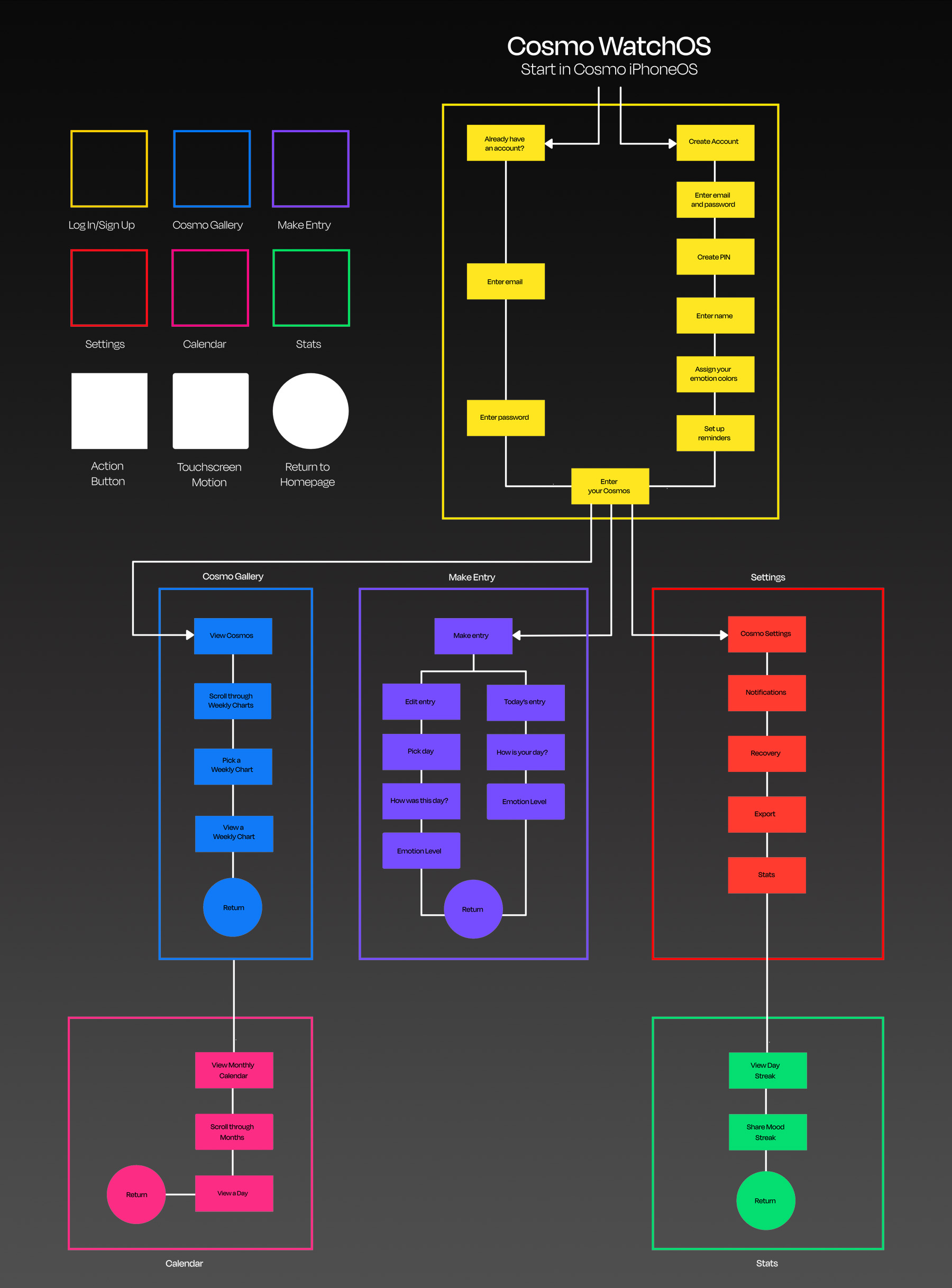


PROMOTIONAL DELIVERABLES
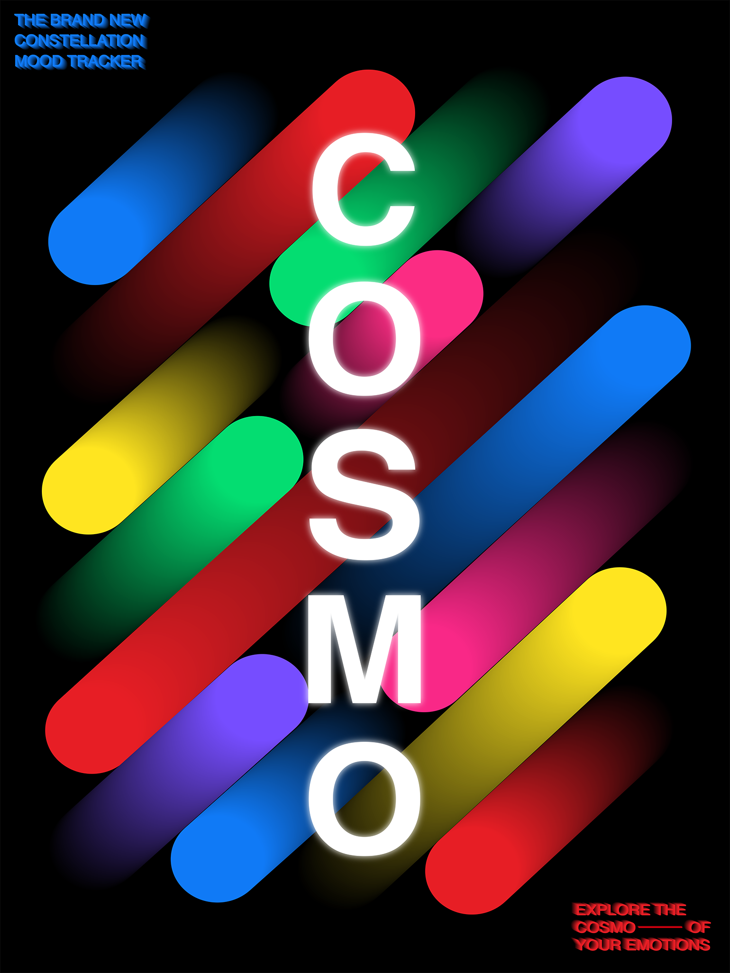
To further establish the brand elements of Cosmo, specifically in a promotional context, I decided to create a series of posters that can exist digitally in full, or also be broken down into individual assets to use across a variety of other graphics for ad campaigns and social media posts. These posters make use of the colors, shapes, and type consistent in the design of the app, and also follows a similiar narrative voice in the slogans and brand descriptions to create a cohesive brand.